Thursday, 15 December 2011

Annalise-HERE IS OUR FINAL FINISHED WEB PAGE WITH HYPER LINKS!

WAY WE ARE DONE :D !!
And hope you enjoy it.

FINISHED DIGI PAK!!

We have finally finished our CD cover :D We are really pleased with the out come and we feel that it is the same style and genre as our artist. I really like the use of paint splatters, especially on the front cover, it is as if the black is leaking on to the white. 


The transparent section on the front cover will be white when it is printed out. Also we think the 'TRON' front is really effective and ties well with our bands image and tech style of music. 


This is the inside of our CD, we continued the paint splat theme on to the actual CD, by using the same font on the CD also we have continued the theme throughout. The best part for me is the pictures we took and adjusted ourselves, they really make the inside stand out!

Annalise-here is our finished web page

here is our finished web page i think i might have a little fiddle with somethings on the web page but this is the the main idea hope you enjoy.

Wednesday, 14 December 2011

Completed!


This is the completed inside of our CD cover, although I have changed the background colour to pink which is temporary at the moment, If the girls don't like the new look we can change it. I really like the grid, i think it is very effective, we obtained this idea from the front cover of the Chemical Brothers album. 


This is the front and back cover of our digi pak. Again I have altered the colours because I feel they are more eye catching and fit to our bands style better. But again if the girls don't think like new look works we will change it. 

Monday, 12 December 2011

Thursday, 8 December 2011

Annalise-new webpage

Heres the new the website I've done I've changed the background to red as I believe thaty this suits our artist more . Hope you enjoy .

Inside of DiGiPak


This is a screen grab of the inside of our digipak. Ella and I have edited pictures to create this multi coloured grid, we plan to have to whole of the left side with this effect.

Wednesday, 7 December 2011


This is the type of effect we wanted to create with our disco ball, we will be using 3 point lighting to create this. 

Opening Footage


This is a short into to our music video that I have edited. We will not be using this exact footage because we are using a different location now. Also on the last shot, the darkness is a problem next time we will insure the space is well lit. 

Monday, 5 December 2011

Ella Berrisford - cd cover progress

Today we did our CD cover as you can see and we changed the inside of our CD cover due to it not being to challenging and we use my lushes lip.

Wed site So Far

This is a screen grab of our website so far, I really want it to look affective and edgy so this needs to improve. I will be coming in more lunch times to adjust this.

Monday, 28 November 2011

Ella Berrisford - Inside CD case


this is our finished inside cover for our CD we are quite happy with it, but we still may change bits as we go along but this is the kind of idea we are going for.

Ella Berrisford - CD cover - working progress


Today we did the first bit of our real CD cover. this is what we've done so far, we are happy with the writing and colours. we hope to add the pictures of a disco ball and change the background so its not all black, it will have reflections from the disco ball.


This is some short clips put together of some of the moves we are planning to use in our music video. The angles used are not specific but will be similar, there will be many more moves involved. 

Basic Website Plan


This is one of our website plans that we created, although this is a tad boring. I am going to created a more eye-catching and geometric design with hexagons, which will fit well with our techo/robotic style of our cd cover. 

Thursday, 24 November 2011

More Photos

These are some test shots from the shoot. The girls costumes, skimpy outfits and their sexual faces. This is the look we need to parody the 'Call On Me Video'. 


The poses the girls are in are moves from the music video.

More Photos

These are some test shots from the shoot. The girls costumes, skimpy outfits and their sexual faces. This is the look we need to parady the 'Call On Me Video'. 


The poses the girls are in are moves from the music video.

Photos

These are the photos of our dance studio location (EMPTY) 


We filmed our first shoot in this space but because we will have to re-shoot, we will now be filming in Ella's smaller mirrored studio. This will be a lot cheaper...FREE! 

Thursday, 17 November 2011

Ella Berrisford - Fonts for CD cover


these are a few examples from www.dafont.com of fonts we are interested in for our CD cover. We like the kind of futeristic look about them, they were found under the sci fi section which fits quite well with the genre of our band. 'Tron' is very similar to an existing font they use on one of their CD covers so we think linking close to this will be a good idea as it will be in keeping with the bands image. Having said this we are considering painting the fonts ourselves with lumionous paints, we will test both types and see which comes out better. 

Web page 2


We don't particularly like this web page but we do find her logo eye-catching and very colourful! Although we wouldn't this style of logo for it doesn't fit the genre of our artist. But we do like the idea so we could always experiment.

websites

This is Eric Prydz's website, we like the layout design and the colours really stand out against the black background. We think that the new media is on trend and that its eye-catching, this attracts his fans to his news feeds and latest updates. We would like to try something similar on our web page.

Our music

This is the song I found for our music video, we are going to shorten it because it is a little bit to long.
ENJOY...

Monday, 14 November 2011

getting ready for our filming this weekend

 
For our music video we need an workout dance and here is a work out video that we find has great moves and we would like to try some of them out this Saturday we will ask our  dancers to watch this video before this saturdays shoot. 

Saturday, 12 November 2011

UV Paint


These UV paint pots are from eBay that we could buy to use for our CD cover.
The paint is £2.25 each and £1.65 for postage and packaging. We will only need 3 or 4 colours, its should be too expenctive!

DiGiPak

I have got some back material that we are going to use for our CD cover that we will paint on (House Rulez) I had the idea that we could use luminous paint so it will stand out more. Also the font will be like it has been painted on, messy but still readable. We thought that by painting the text on the shimmer from the disco ball would be on the letters too, instead of us adding the text on in PhotoShop. We think this will be a good effect for the front cover.

On the back we are also using the black material, but we will no longer be using potatoes to print with (they will be too small). We are going to use the luminous paint to do the house shapes and again paint on the song titles.

Boom Box

I am really pleases with the progress we made in Thursday's lesson, with our cardboard Boom Box!! It should be finished at the end of Monday's lesson, ready for our first shoot on Saturday :)

We decided to keep the box its original brown colour because we thought it would add to the humour of our music video. Although we may have to go over the outline of each button we have made, so they stand out on camera.

Work in progress!

Thursday, 10 November 2011

Ella Berrisford - Our BOOM BOX in progress


This our Boom Box in the making we will finish photos next week !!!

Annalise-Workout Baby

This is the music video that I looked at. This video goes against a music videos dominate ideology because In normal dance music video's you don't see men in tight colourful clothing. Also they do dance moves that men wouldn't really do it would be more of an female thing to do. But in this music video they have close ups of there lips and we like this idea and this will be try tis out in our music video. 

Annalise-The Boom Box

Here are some imagers we have that we like for are Boom Box that we will be using for inspiration. 
We like this Boom box but we are not going to paint our Boom Box because we want our audience to see thats it's not a real Boom Box to show how unrealistic our music video is. we also like this Boom Box a lot because we will be making our Boom Box by hand too.

Annalise-Mason vs. Princess Superstar - Perfect (Exceeder)

Here's the video that EllaB looked at this is another Video that had dominate ideology of an dance music video all the girls are sexy and have a lot of make-up on but this also goes against dominate ideology because when you go to the gym all the girls there don't where tight clothes and they wouldn't as flawless as they do here. 

Annalise-Call on me

Here's the video that EllaM has look at we all like this video's idea in the way that it's uses dominate ideology of an dance music video with the girls in tight clothing,bright colour and and showing a lot of skin. We also like some of the dance moves so we might mimic them.

Annalise-three point lighting

With these Images below we find that there are shadows which don't look nice and distract the viewers eyes from the disco ball so with this idea above the three point It helps use place a shadow where we wish it to be.So now the viewers eye's will not be distracted but the large shadow and it looks good and our idea for our CD cover will look amazing :D

Monday, 7 November 2011

Annalise-Test shots for our Cd Cover

Here are our first test shots we like Imagers 3013, 3011, 3009,3008, 3006, 3003 and 3004 the best.

Thursday, 3 November 2011

Ella Berrisford - Digipak Annalysis


  • The digipak is suitable for the genre of music as it uses the contrast of dark and light colours giving a ‘dance’ ‘disco’ feel about it.
  • There is half a man’s face in the background next to bold white capital writing stating the artist’s name. The way the face is portrayed with shadows it keeps the element of mystery Eric Prydz has, which is quite a common feature for artists in this genre.
  • The writing is slightly to the left but it is big and dominates the cover, giving it a sense of importance and suggesting his literal image is not important its about the music.
  • It looks professional and classy, selling the artist. Even though there is not a lot on it, it looks good and to the point.


Own digipak

For our own digipak we wanted a simple front cover, like the Eric Prydz one we intend to use a dark background with something such as a disco ball on the front to stand out. We thing this is appropriate to our genre as this seems to be a convention a lot of artists in this genre use.
 

Ella Berrisford - website annalysis


Image & Logo
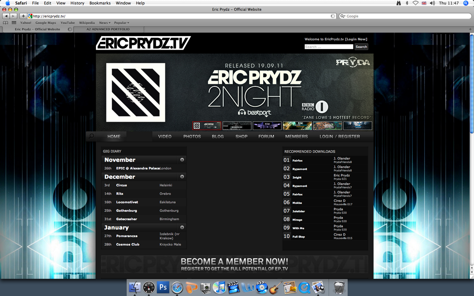
The band I looked at was represented by images of a lit up stadium from different angles. The images were very high tech and gave off a ‘future’ look about them. They didn’t represent themselves with a single picture of them, keeping their actual appearance a mystery to fans. The logo was places several times on the page, bigger at the very top in the middle. It was just a simple distortion of the word ‘epic’ in capital letters in black and white.

Genre
The generic conventions of a music video were incorporated by the style the website was presented. The bright colours on a black background really stood up and went well with the ‘dance’ ‘electro’ style of music. There were images of crowds going wild again fitting in with the style of music showing people having a good time to it.

New Technology & Links
They had a list of ‘recommended downloads’ down the side of the page, linking the audience to a site to purchase their music. They also had links to social networking sites such as twitter, which is quite a new technology that offers fans other ways to get more personal with the band. They have a link at the bottom to purchase new merchandise and sign up for more information. There is a photo gallery to again persuade the audience to want to buy tickets to see them live. They have a big advert about there up coming gigs at the top of the page and a link to purchase tickets.

Colour & Style
The overall colour and style suggests the artist is a modern ‘techno’ ‘dance’ group. Possibly more suitable for males as the colours used such as black red and green are quite masculine and has an ‘adventure film’ look about it which are mainly targeted at males. The colours are easy on the eye making it easy to look at the page for a length of time. The up to date information is laid out in easy access places so you don’t have to search around for a long time to find what you want. Suggesting the band is up to date and modern.

Written content
There is very little written content, but what there is in clear capital letters. It is short and to the point, again suggesting they are more aimed at males as they would prefer this rather than really a lot.

Font & Layout
The font and lay out add to the construction of the artists image as they are in keeping with the modern image. The font is very clear to read and bold, funkier fonts are used on the moving images at the top of the page to add interest but any important information is in capitals and clear to read. A simple layout is used making it easy to navigate around, there are a lot of links, but the first page is quite small and to the point.

Target Audience
The target audience are clearly males by the look of the website, with the use of masculine colours and styles of writing. There is nothing ‘pretty’ to look at on the page it is all very technological. Links such as music download and forums are used to get the target audience involved.

Advertisements
Radio one is advertised at the top of the page, which is in keeping with the genre of music as they play this type of music a lot on their station. Other than that there are no other advertisements that are not to promote and sell the artist.


Annalise-our backup location

These are the photos Annalise and myself took of the Bilborough College dance studio as a back up location.